Tuesday, April 16, 2019

Review: Nikkor Z 50mm/1.8S

Like many others, I was lulled into the Z world by the $300 + free FTZ offer and I bought the Z7 together with an M2Z adapter to shoot with my Leica lenses. I have also bought the 50mm/1.8S and the 35mm/1.8S. I have been using Nikon for more than 20 years and Nikon does not pay me a single cent for this review. I wrote this review to help other Nikon users. So, off with my review!

Introduction

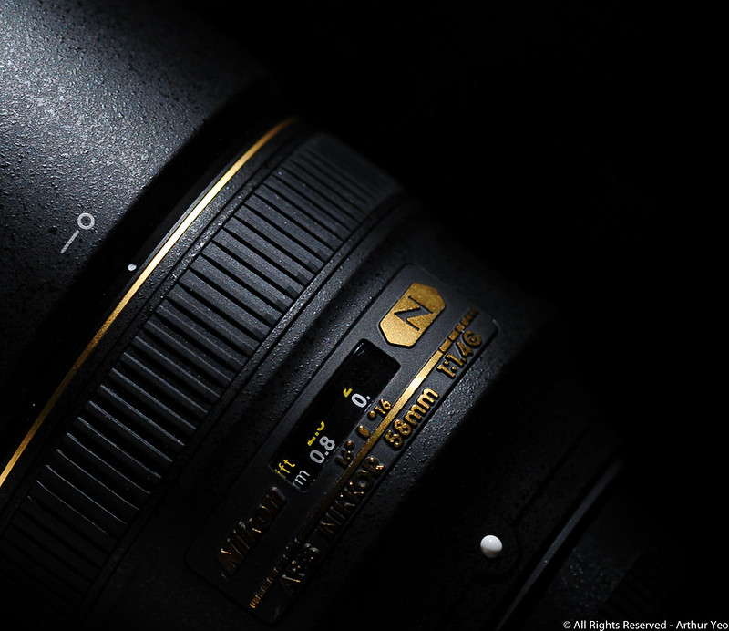
In this article, I will review the 50mm/1.8S lens based on real world tests. By real world tests, I will use 3D objects, not flat 2D lens chart. I will stretch the lens in different types of lighting conditions in the real world and I will try to use the lens like in the real world so you will know how this lens truly behave in the real world.

Resolution

In general, the lens has impressive resolution. Nikon did a commendable job in focusing on resolution and it is a stellar success in this area. I love high resolution lens and the success in this area fits the bill. I have nothing but good praises for the Nikon engineers for setting a new benchmark for consumer lenses in this area. The published MTF diagram depicted clearly that this lens is, indeed, a rather high resolution lens. Red line indicates a high resolution for coarse structure, starting at well above 90% all the way to around 17mm away from the center, before the resolution started to decline. Both the red line and red dotted lines dance and follow each other closely, indicating a rather nice bokeh for large structures when they are defocused.

CLICK on image to see higher resolution version
Turning to resolving power for finer structures, following the blue line, that has a modulation frequency of 30, these lines measures the ability of the lens to resolve fine structures. The measured resolution starts at around 80% at the center of the lens and starts to decline at around 15mm away from the center. The blue and blue dotted lines do not follow each other as closely, so the bokeh of finer structures may not be as smooth. Hold your thoughts about that.

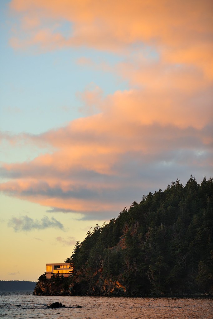
High contrast scenarios

Under high contrast lighting condition, if the aperture is fairly stopped down (smaller aperture), the overall sharpness is consistent with what the MTF tells us. Recall that most lens manufacturers publish their lens MTF diagrams based on the widest aperture of that lens. When the lens is stopped down, the resolution should rise till it peaks around f/4.5-f/5.6. Usually, the resolution stays there till f/8 and starts to drop a little when you reduce the aperture further.

This is a fairly high contrast lens so under a high contrast lighting situation, you may want to change the Picture Control to a lower contrast setting unless you want the contrast high. One reason could be post-process it into a B&W image (like the above).

Bokeh

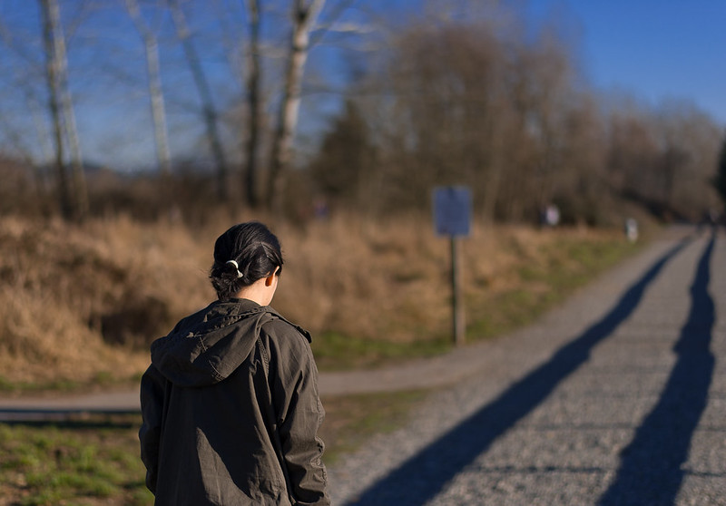
Bokeh is the smoothness of the defocused background or foreground when a large aperture is selected to capture that image. The smoothness of the bokeh, to some people, is subjective. Personally, I do not think this is true. Most people will instantly recognize a silky smooth and attractive bokeh versus an unwieldy and coarse bokeh.

What is a good bokeh? 
Here are a couple of example of good bokeh, shot with a 
Leica Noctilux (left) 
and Nikkor 200mm/2VR (right)
Under most shooting conditions, the bokeh of this lens is alright but in certain conditions, the bokeh characteristics can be questionable. It all depends if your own applications do fall into these situations more commonly or not. The bokeh becomes regrettably unappealing when these two unfavorable conditions occur:
  1. high contrast lighting condition
  2. numerous small structures are present in the background 
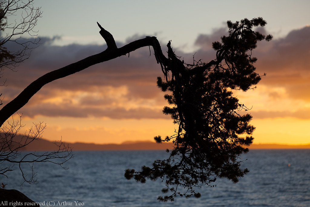
Here is a clear example of what I consider an unacceptable bokeh shot with the Nikkor 50mm/1.8S at f/1.8
In the above example, one can almost feel the coarse structures of the cherry blossoms in the background. Note that this image was shot at the lowest ISO 64 and yet the image felt like it was shot in high ISO. The apparent graininess stood out like a sore thumb. I cannot accept this bokeh as beautiful, I am truly sorry, Nikon. You can deny it all you want. One thing you corporate leaders ought to do is to instill in your engineers to be truly objective in their evaluation and not get all biased by their own internal culture. Get them to look at the competitors and compare.

Enough grumbling. The way to resolve this issue is to lower the contrast of the image by selecting Picture Control = {Flat, Portrait or Neutral}. It will help to tame the ugly bokeh by, perhaps, 30-50%. This method to resolve the problem does limit my use of Landscape and Vivid in my Picture Control. The pleasure is dropping.

Controlling Aberrations (Chromatic Aberrations)

Next, Chromatic aberrations (CA) is a lens defect which occur when the lens cannot focus light of different colors (wavelengths) onto the same spot. The symptoms of this is the weirdly colored fringing occurring on the edges of the structures in the image. 

A regular lens is normally corrected for 2 of the 3 major colors. A good apochromatic (APO) lens is corrected to a few of the major colors. A superchromatic lens, used for satellite images, are corrected for 7 colors.

This lens correct its CA appreciably well. But, in high contrast situations against the sky, it needs a little more help with more extra-low dispersion (ED) elements in the mix to tame its CA; albeit, the lens was opened wide at f/1.8. The tree in a backlit situation revealed the purple fringing quite easily as shown in the enlarged version on the right. This purple fringing did not really completely go away until I stopped it down to f/4.5 or smaller. If the S-line of lenses are supposed to compete with the big boys,  this kind of CA should not be there. When that happens, the S-line of lenses will not be considered in the same league.

Light sources in the dark

One of the most challenging lighting situations are nocturnal images. These situations reveal, often accentuate, the weaknesses of the lens. It is similar to putting the lens performance under a microscope and observe how the lens behave under stress.

Under such circumstances, we need to be cognizant of another type of lens aberration (under the category of monochromatic aberrations) called spherical aberration. It is monochromatic because it has nothing to do with colors. It is a defect in the lens where it is unable to depict point source lights as crisp dots when they are in focus. If these point source lights are capture near the edge of the image, not only are they fuzzy, they are like the shape of a butterfly. This is called a coma effect. If the light sources are larger, the lens exhibit fuzziness and at smaller aperture, the light source should be depicted as a star burst. That star burst should be clear and crisp, not fuzzy.

NOTE: I'm not discussing how a starburst image is formed by the light source. That's caused by a phenomenon called diffraction spike. I'm raising the issue why the starburst is low contrast, has low clarity and blurry.

Here is an example of a good lens which exhibits good correction against such aberrations.
Shot with a Nikkor 35mm/1.4G @ f/8 on a Nikon D3


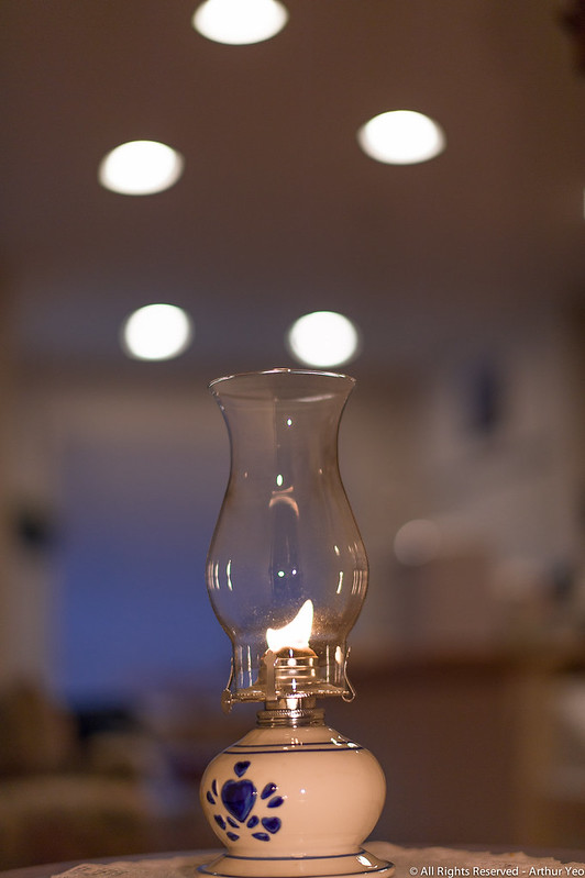
I put this lens to its paces and the results are quite revealing in the dark (no pun intended). Below I show you the actual image shot at night at F/8.

Shot with Z7 + Nikkor 50mm/1.8S at F/8.
CLICK to see the 2K image
And, to give you a zoomed in version of the street lamp, it will give you a better feel of how fuzzy the light source was. Note that light source is in focused so a well corrected lens must depict a crisp light source.


Conclusion

On the whole, I'm very happy that Nikon has put both her feet into the pursuit of the mirrorless market so she will not end up like Kodak or Polaroid as a business. The new S-line of lenses have higher resolution (what a joy!) and I embrace it with much pleasure. But, in her excitement to push new products into newer markets, her engineers seem to have lost some balance in their designs for the lenses. Good lenses, like pleasurable sports cars, are balanced in their designs. They should have high resolution, good bokeh, decent contrast, no flare and exhibit very little CA. Try using the Zeiss Otus and Leica lenses as benchmarks. High resolution alone is insufficient to compete.


Monday, February 17, 2014

AF Fine Tuning (AFFT)

Like many, I used to only use a lens chart to do AF Fine Tuning (AFFT) on my pro Nikon camera bodies. Based on my experience, I seem to be getting a hit-or-miss experience. I just simply cannot get a clear scientific right or wrong procedure using this method. The results I am getting was fuzzy: sometimes, it was spot on and sometimes, it was not correctly focused. The really confounding fact is that on the lens chart, it was clearly correct but when I started to shoot real life humans, the focus was off. It was lately that I found the method below to be more definite in getting the results I wanted. And, I am writing this especially for people who are having problems getting their AF tuned for the Nikkor 58mm/1.4G.

Subject : What is your subject matter?

If only a lens chart is used to do AFFT, the resultant AFFT may be questionable. Why? 

First, we are aiming the camera at a flat 2D lens chart. That’s a significantly easier focus scenario than real life. In real life, your subject may be shot at an angle with parts of it behind the focus point and some parts before the focus point. This scenario challenges the AF subsystem much more than a flat 2D lens chart.


Second, lens charts consists of black and white lines. That is the highest contrast one can ever obtain under the light condition you are using. It is the extreme and it is the easiest on the AF system to obtain focus. If your subject matter is also high contrast B&W lines, then a lens chart is fine. But, unfortunately, for most us, our subject matter is not solid B&W. It is usually shades of other colors and the focus point may consists of shades of much lighter colors and lower contrast. This will affect the AF system behavior. In general, real life scenes are that much more challenging than the high contrast B&W lines.


So, what do I do to solve this? I use a lens chart to bring the AFFT closer to its correct AF tuning vicinity but I will move on to further tune it using subjects that are closer to what I will be shooting in real life. Below, I list the steps I take after I have AFFT using a lens chart to verify and fine tune the last bit matching it to the real life subject I will be shooting.


How to check if AFFT is correct after tuning it using a lens chart?

  1. Open the lens to the widest aperture.
  2. Mount your camera on a tripod.
  3. Pick a subject closer to your real subject. E.g. if you are a wedding photographer planning to cover a wedding for a family consisting of mainly people with fairer skin tones, get a test subject who is typical of that ethnic group; preferably, with lighter color eyes so that it will really strain the AF system for the more challenging scenarios. (Recall that lower contrast, lighter color means harder to focus when light is poor.)
  4. Focus at your subject at an angle and pick an identifiable focus point on the subject. E.g. Sit your subject down, adjust the tripod height so that it is at eye level of the subject and place your camera so that you can shoot from an angle from the subject’s side.
  5. Make sure there are clearly identifiable parts of the subject directly after to the focus point. E.g. focus on the nearest eye but at the corner of the eye furthest away from you so that you have the bridge of the subject's nose as an identifiable point beyond the focus point.
  6. Make sure there are identifiable parts of the subject directly before the focus point; e.g. the corner of the same eye nearest to you.
  7. Shoot the image
  8. Zoom in the image on the LCD panel at the focus point
  9. Evaluate the vicinity of the focus point and see if the image displays the focus point as the most focused
  10. If the focused point is the sharpest compared to the point before and after, then you are done. If not, your AFFT is still not quite correct. Determine if the sharpest point is before or after the focused point. 
  11. Go back to your camera menu and adjust the AFFT accordingly by a couple of notches to compensate for the slight focusing error.
  12. Go to Step [4] and re-do all the steps until step [10] evaluates to true.

Disclaimer

I do not claim to be a expert nor a professional camera technician or optical physicist. I am merely sharing with you based on what I have found in my own experiences and hoping it will save you some time with your own photographic pursuits.


Thursday, January 23, 2014

Zeiss Sonnar 135mm/2 APO ZF.2


Introduction


Whenever I pick up my Zeiss Distagon 21mm/2.8 and the Makro-Planar 100m/2 to photograph things or people, the images that are produced by them often leave a big smile on my face. When our friend Carl Zeiss released the news about an APO lens for ZF.2, my heart leapt for joy. The last true APO lens I owned was the Leica 90mm/2 APO Summicron-M. It produced the most corrected colored images I have ever seen. I sold it away because it was a very difficult lens to focus on a Leica-M. Now, I am deeply thrilled that I can own yet another APO lens and this time it will be paired with a Nikon DLSR!


Apochromatic (APO) Lenses

Before we talk about the Zeiss Sonnar, one question which might come into your mind may be this: what is an apochromatic lens? Since you are going to spend the money, it might be worth your time knowing what you are buying.

As you may already know, when white light passes through a glass prism, it gets bended and that white light is dispersed into a spectrum of rainbow colors. There will be a similar occurrence in the lens elements if the lens designer did not correct it. Leaving it uncorrected is not good because you will see color fringes on the edges of your subject where higher contrast is present. That high contrast edge is usually where the edge of your subject meets the air and behind that airy domain is where a much lighter and brighter color exists. When the light transitions from the edge of your subject to the air where the color is lighter or brighter, a colored fringing occurs at the edge of your subject. Obviously, the reverse is also true: when the subject is brighter than the surroundings. Fringing can be present on the edges of your subject in this situation as well. When this occurs in lens optics, it is called an aberration; specifically, a chromatic aberration. This fringing effect also presents to the human eyes a reduction in sharpness because the edges are no longer sharp delineations.

Most regular lenses are corrected for two of the primary colors; namely, the Red(R) and the Blue(B) end of the spectrum. What's in between is called the secondary spectrum. Naturally, correcting only the R & B areas of the spectrum will still produce color fringes in images under harsh lighting conditions.

Although there are no industry standards to define a lens worthy of the classification of an APO lens, most major lens crafters agree that for a lens to be called an APO lens, the correction for chromatic aberration must be corrected not just for R & B but must also include Green(G); thus, corrected for all three primary colors, RGB. Some manufactures have gone further to correct for seven colors and named their lenses superachromats. In fact, that was what Zeiss did in the 1970's during the Hasselblad days. That type of lens was, indeed, used first by satellites to photograph parts of earth to produce images that can accurately reveal minute color variations on the land for scientific analysis.

Color Fidelity

The Sonnar 135mm/2 APO lens is clearly a true apochromatic lens because it was manufactured under the venerable Zeiss brand. One of the most illustrious Zeiss employees, Ernst Abbe, was the person to invent the apochromatic lens for a microscope he was designing back in 1868.  While we can marvel at the historical facts, real life facts prove the point instantly. Click on the image to the left and see for yourself how crisp the color was faithfully reproduced. Examine the gold prints of the Lindt chocolate company logo and see for yourself how well defined the light was reflected as it transitioned from the bag's light gold to the logo's fine gold trimmings.


Here is a second challenge I gave to the Sonnar lens. Strong backlit light pouring out from the sun onto a tennis ball. What do you see at the edges of the tennis ball? I see a clear delineation without any fringes at all. A regular non-APO lens would be hard pressed with this challenge.

Are you savoring the technical achievements produced by the Zeiss engineers? Is this sinking in? To me, this is a technical marvel which I can hold in your hands to create images of my own and I love that feeling. This is the kind of color fidelity and resolution I expect when I hold an APO lens in my hands.


Bokeh

Bokeh in almost all of the Zeiss ZF line of lenses are pleasing, including their wide-angle lenses such as the Distagon 35mm/2. Some, though, are better than others. I find it hard to differentiate the bokeh between the Makro-Planar 100mm/2 and this Sonnar.  However, with the 135mm being a longer lens, optically, I see more defocused areas when the aperture is opened wide and the subject is close compared to the 100mm Planar under a normal non-macro shooting scenario. As a result, I get to enjoy more of the smooth silky bokeh which this Sonnar seems to be an expert in. The bokeh produced by this lens is, undoubtedly, one of the most pleasing I have seen.

Resolution

The Modulation Transfer Function (MTF) graph  published on the Zeiss website for this lens indicated a high resolution lens. 

Both the sagittal (the bold) and tangential (dotted) lines for the 10 line pair (lp) spatial frequency are above the 90% mark on the Y-axis. Please refer to the top 2 lines that run horizontally across the graph. Not only that, they are almost flat straight across all the way to the edge of the lens. This is excellent news: in terms of resolving for large structure objects, this lens is sharp all the way to the edge of the image.

Moving down to resolving for mid-size structures, the next pair of lines resolve for 20 lp spatial frequency. It looks like the same story, flat straight across with a mild bent downwards when you reach the edge of the lens.

It's not until you look at the finest resolution performance at 40 lp (refer to the bottom-most pair of lines) do you see a fair amount of bending at the edge.

All in all, the resolving capabilities of this lens is up in the top end compared to other high-end lenses in the market. One can find a 3rd party  DxO Mark lab test that showed the details in comparison to other lenses. This lab test actually showed that the sharpness is quite close to the industry standard reference lens, the Zeiss Otus Distagon 55mm/1.4.


Physical aspects

The physical aspect of unboxing this lens came like the rest of my experiences with other ZF lenses. They all came with a signed quality control card, like a greeting card from the quality-control manager. All markings on the lens are engraved and painted; no printed stuff,  as usual. The focusing ring has the same Zeiss touch: buttery smooth and has enough inertia for very accurate focusing. Pinching the lens cap had the desired effect of removing the cap and when released, the spring snapped it back on. The length of the lens is longer than the 100mm Makro-Planar and the weight is heavier. But, trust me, it does not weigh like my Nikkor 200mm/2.


Nikkor 200mm/2VR2 

For those who are familiar with the Nikkor (Nikon) 200mm/2VR2, it sounds like it can and will challenge this Sonnar in terms of color fidelity, resolution and bokeh. But, there are a couple of differences we need to be aware of and I would like to share with you a few pointers based on my experiences with these 2 lenses:
  1. Weight: The weight of the Nikkor is incomparable to the Zeiss: approximately, we are comparing (D3/4 + lens) 9 lbs  to 4 lbs. You need strong arms to use the Nikkor handheld.
  2. Auto focus (AF) speed: If you do not need AF, then the Zeiss Sonnar will do just fine. I need to highlight the fact that the Nikkor was designed for speed; so, if you need AF speed, the Nikkor will fit your needs.
  3. Price: The Nikkor is not only hefty in weight, it is also hefty in price. Again, we are comparing,  approximately,  $6,000 (Nikkor 200mm/2VR2) to $2,000 (Zeiss APO Sonnar 135/2)
In short, the two lenses are made for different purposes, so comparing them is not profitable.

Conclusions

If there is a good reason or a few reasons for buying this lens, it will be all about color fidelity, resolution and pleasing bokeh. If you focus your image capturing efforts on the above strengths when using this lens, you will be pleased and I would dare say that quite a few of your images will amaze you and give your eyes a feast!

Complaints

I have no complaints about this lens. Everything came and performed as described. I am a very satisfied customer. If I may suggest one improvement: it is still quite difficult to pinch the lens cap to remove it. May be Zeiss would consider increasing the depth (or the thickness) of the lens cap so that the fingers will find more space to pinch the cap with ease and remove it without slipping.


Tuesday, January 21, 2014

Nikkor 58mm/1.4G ASPH (Nikon)


Introduction


When I read the reviews from popular reviewers, like Ken Rockwell and Thom Hogan, I was slammed with a ton of negative press information about this lens. Then, I started to look around at images shot by photographers around the web. Not all photographers were able or know how to take advantage of the strengths in this lens. And, I started noticing that this lens has some characteristics which I like when I looked at the images from the few skillful photographers. In this article, I beg to differ in opinion and hope to reveal to you that this lens is worth its salt. I will not talk deeply about lens-chart shooting results as you can get that from the other reviewers nor will I talk much about the specs of this lens as you can get those straight out of the Nikon website.


Design goals

The design goals of this lens was clearly stated when the lens was released by Nikon to the market. To save you time reading the original article, here are the summary of their goals:

  1. The design of this lens wants to minimize:
    1. sagittal coma flare: in layman's terms, this means that when you shoot at night, the point light sources will remain round or close to round. There will not be a little flare bubble around each point light source but a crisp light ball even when the aperture is wide opened.
    2. fringes: i.e. minimized chromatic aberrations. This was confirmed by the DPreview.com lens review.
    3. distortions: the lens should exhibit little or no distortions
    4. light fall-off:  should be hardly noticeable when shot wide opened
  2. Bokeh: when the eyes sweep from the focused to the defocused areas, the change in the image should be moderate. This produces a better 3D feel than abrupt changes.
  3. Applications:
    1. distant night  landscapes
    2. nightscapes of urban area: yielding clear and crisp images even when shot wide opened
Tones

Lenses that produce consistent tones are not very common, I tend to be very selective and critical. One of the commendable properties of this lens is its ability to produce tones which are deliciously beautiful to my eyes. What do I mean by that?


In shooting  environmental portraits under natural light in low-light or not so conducive lights, the image after I edited it must look like what I saw when I was shooting. The low-light property should be reflected in the post-edited image. Poor lighting usually leaves shadows and sometimes long blocks of shadows. Low light also leaves the facial textures un-studio-like. So, low-light portraits is not about artificially inflating the looks of the subjects but to let the light tell the truth about the subject and most of all, allowing the light to reveal the mood and the atmosphere. I want the image to look like what I saw: that's the ultimate aim. It usually looks grim when the light is low and unflattering. The skin usually does not look smooth and the light should fade away rapidly from the main subject. But, the lens must draw the image with the same mood, same texture, same color nuances, same tonal drop from lighted to darkness. All these are highly subjective and personal. And, not many lenses can do this well.

I certainly do not want my image to look super bright, like what the camera will do to the image when all the default settings kick in to capture the image. It is alright that the camera tries to push the pixel wells to capture as much light as possible. That will firm up the pixels for the highlights and when I reduce the exposure during the editing, the highlights will actually look more natural. So, don't get too annoyed at the camera for doing its job. Having enough light also allow the sensor to grab the colors.


Colors in low-light


I personally prefer colors in low-light to be more accentuated than dull because when the exposure is reduced during editing, the entire picture will become dull. The colors must be captured by a capable lens. This Nikkor lens has this ability and it is able to do so with amazing spectacle. It's ability to grab all the different subtle shades of colors  is quite amazing. This property in the 58mm/1.4G Nikkor reminded me of the Leica Noctilux-M f/0.95 ASPH. That Leica lens is the super monster in being able to do that and this Nikkor is one of those lenses. The nuances of color together with the tonal properties reminded me of old time National Geographic images shot in Kodachrome. Yes, the images have a Kodachrome feel to my eyes.


Bokeh

Everyone raved about the bokeh when they reviewed this lens. Whatever they raved about concerning the bokeh is real. For those who do not know what bokeh means, here is a short explanation.

Bokeh is a Japanese word which means the infirm, the weak and the subnormal. But, in photography, it refers to the blurry background or the defocused part of your image. Photographers and taste-conscious viewers of photographs tend to favor a smooth and gradual defocused feel. Some described it as silky, smooth, creamy and some called such lenses as Cream Machines.


This property of a lens does not have a standard way to measure it. As of today (Jan 21, 2014), none of the major lens crafters like Carl Zeiss, Leica, Nikon or Canon has a standardized way to measure bokeh. So, scientifically, the bokeh of a lens is not measurable but almost everyone who knows what good bokeh is will be able to tell you when he sees an ugly bokeh. Well, this lens, in general, has very well behaved bokeh and pleasing smoothness most of the time. Every lens has some weaknesses in their bokeh such that when the subject is under certain lights in the presence of certain background structures and are in certain distances: all these can contribute to aggravate it to produce ugly bokeh. You need to know that bokeh even changes in characteristics based on the sensor of the camera. The bokeh of the Nikkor 200mm/2 is supremely beautiful and smoothest but it is smoothest in a Nikon D2X sensor compared to the D3. Below is a case where the lights were challenging and there were quite a bit of structures to cause ugliness to the bokeh but this 58mm/1.4G lens was still able to smoothen the background up to the point of making it pleasing.


Focusing speed and Accuracy

The AF-S Silent Wave Motor chip-driven auto-focusing is quite fast when the light is bright. The main complaints come in when it is shot under less than ideal lighting. I have not stood around waiting for it to focus (like my experience with the Nikkor 105mm Micro lens) but I would say that every once in a while (perhaps, 20-25%) of the time, it may hesitate once or twice but it is nothing so bad to report about. One more thing to consider is the camera body that was used to test focusing speeds. A D4 or D3 body will focus faster than a D800 or D700 or any other lower tier bodies.

Some owners decided to adjust their AF Fine Tuning setting on the firmware of their camera body for this lens. This feature allows the owner to customized the AF by fine tuning for each lens and the firmware will remember them in its memory. The key in successfully fine tuning for this lens, or any lens, is to shoot subjects that are very common in your shooting projects. Using a lens chart to adjust your AF Fine Tuning is not good because your subjects' tonality and contrast are not the same as a lens chart's white and black lines. For a technique which I found through experience on how to fine tune your AF, please refer to this article.


In terms of the focus accuracy, many people like to compare this lens to the 50mm/1.4G Nikkor. I think one has to realize that this is 58mm, not 50mm. The f/1.4 Depth of Field (DOF) is so much thinner when you are photographing a person who is less than 5 ft from you compared to the 50mm/1.4G lens. As such, even your breathing will cause your subject to be out of focus even after you think you nailed the focus. Additionally, your subject is also breathing. So, both your subject and you are breathing and the thin DOF will make sure you fail easily in your focusing! What should you do?

Shoot more images and hope that one of them is correctly focused. And, make sure the ISO is high enough to maintain a reasonable shutter speed.


Resolution


The Modulation Transfer Function (MTF) diagram posted in the Nikon website for this lens tells me that this lens has higher resolution than the 50mm/1.4G Nikkor.  Again, some reviewers complained that they are not seeing the resolution. I am not convinced by their complaints and I own both the 50mm/1.4G and the 58mm/1.4G. My short experience with the 58mm/1.4G tells me that the resolution of this lens is higher than the 50mm/1.4G when my focus is correct. 

We also do not want to forget that if the subject is close (i.e. 5 ft or closer), the fall off in the DOF is going to be more dramatic than the 50mm/1.4G. This is yet another property which people do not keep in mind when they compare the two lenses. In other words, if you shoot really close, the ultra thin DOF is going to make the 58mm/1.4G look less sharp because there are going to be larger defocused areas than an image shot with a wider lens such as a 50mm lens even though the f-stop may be the same.


Conclusion


You need to ask yourself what you want to use this lens for if you are planning to buy it. Like all lenses, you should take advantage of its strengths and fit it into a project or tasks which it is good at and you will see it shine.

What is this lens good for? 
  1. It is a lens made for low light or poor lighting conditions. And, you need to edit and adjust the image to make it look like what you saw. All low light digital images require this kind of adjustments. Don't deny yourself this step. It is, after all, part of the artistic process.
  2. If a 3-D feel is what you want, this lens will yield images that are stronger in this area than many others. The images it creates will give you a balanced and smooth bokeh which transitions from near smoothness to a complete blur for far away defocused objects.
  3. Attention was given to correcting point light sources when shot wide opened. That's why two aspherical elements were added into the design of this lens. If you need a well behaved lens in this kind of environment, this lens is made for to excel in this kind of images.

If you want to read the interview with the technical head in Nikon who designed this lens, please click here.


Saturday, February 20, 2010

Nikon 70-200mm/2.8G AF-S ED-IF VRII

This lens looks and feel like the first version except for a slightly shorter barrel. At first, it felt exactly like my older 70-200VR. When I put it in action, the results "feel" different.


First, the VR is somehow quieter and the AF-S feels like its is 10-20% faster as well. For those who have used the old AR-15 (or the M16) rifle and then use the shorter barrel M4, you know what I am talking about. It felt like you can now handle close quarter encounters better. :) Just kiddin.


Second, the optics was quite a treat. Color corrections approaches those of $5000-6000 lenses. I cannot see any visual CA even when zoomed in at 300%. It's amazing what 2 more ED elements can do for your images. Because the color corrections are steeper, the entire image just gives you a much higher contrast feel.


Third, the resolution is certainly higher than the first version both in the center and the edges. Both of these images are shot wide open.


I can say I am quite thrilled by how much this lens can perform in terms of yielding beautiful images of my design and imagination. Do I recommend this lens? Yes, if you have no 70-200mm/2.8 zooms. If you already have the first version, you have to answer these questions:
  • Do you need higher resolution on the edge?
  • Do you use it on DX or FX body? If you only use it on DX body, you may not need the new version.
  • Do you shoot landscapes at f/8 or smaller aperture on FX bodies? If you do, you need the new version. Tests have been done showing that even at f/16, the edges are weak when shot in the FX platform. This was the main complaint from among the pros and enthusiasts.

Thursday, September 03, 2009

Interesting couple of months ...

Leica will probably announce the release of the M9 rangefinder; possibly, with an 18Mpix FF sensor.
My new M9 Flickr group is all ready for it ...
M9Leica


Nikon will probably announce the release of the D700X; possibly, with an 18Mpix or the old 24.5Mpix FF sensor.

Lots of exciting news ...

Thursday, May 21, 2009

Photograph along the edge


The art and science of photography as a whole is some times made too convoluted. One of the dimensions that can easily enhance your photography is to photograph along the edge.

What edge am I talking about? I speak of the edge along these dimensions:
  1. time
  2. space
  3. age

TIME
The edge of time refers to the temporal edge: be it the edge of day and of season. Ask any successful landscape photographer when is the best time to photograph landscape and surely, you will hear about sunrise and sunset. Well, those are the edge of the day. They are the time when night is transforming from night to day and vice-versa. During these times, the lighting conditions are quite often phenomenal and spectacular. It is no wonder why many well respected landscape images are photographed during these times.

In terms of the edge of season, one obvious choice is the season of Autumn. It is the season when summer is transitioning to winter and when the foliage is transitioning into their brilliant display of colors. It is also when fungus are most prevalent. During this time, unusually colored mushrooms and toadstools are popping out on the ground. Spring is the counterpart of Autumn in the reverse direction. Needless to say, flowers, bees and colors abound in almost limitless variations.


SPACE
When I think of the edge of space, I fall back on scenes when I walked along the shores of the Pacific Ocean, along the edge of a lake, along the foothills of a mountain range and along the edge of the forest next to the open plain. Yet again, I am looking for that transition when the landscape changes, when the terrain changes and the land meets the water. The edge of change on the ground often presents itself as extraordinary photo opportunities.

AGE
Transitions not only appear in time and space but also along the edge of life itself: the boundary along the organism's age. Photographing the very young, the ones who were just born --- infants, for instance --- can yield an image that is inherently compelling. An infant who has just transitioned into life outside the womb is a pleasure to behold. A close-up shot of their tiny fingers or toes that reflects the almost brand new skin textures is more than refreshing. They really look so different from most of us adults. On the other extreme, the face of the very aged reflects years of life experiences and wisdom. Sometimes their eyes even reflect certain cherished moments when they talk about them.


Next time, when you are running out of ideas for your photography, think about transitions and think about the edge. And, do not limit yourself to just the edge of time, space and age but a combination of these can be even more eye-popping. Pick up your camera and release the shutter when your eyes arrive at the edge. You may be in for a pleasant surprise.

Happy photographing!